DESIGNED FROM THE GROUND UP!
Designed from a clean slate under a ticking clock, or how Crash Casino was born without a rulebook.
Setting the stage
When working on a global brand, a new product launch is never simple. Between tight timeliness, limited information, and constant changes, it can be the perfect beginning for a horror movie. Spoiler alert: This wasn’t a horror story. It wasn’t a walk in the park either. Could things have gone smoother? Sure. Could they have been worse? Oh, absolutely!
Team work
One thing is certain. This was a team effort. Even with an amazing dev team, success is not about last minute miracles. It was about structure, open communication and each departament pulling its weight.
Before jumping into future improvements, let’s pause a bit, rewind, and analyze what worked, what didn’t, and what we’ve learned. As the Product Design Team, we were one of the first teams to be involved in this complex project.
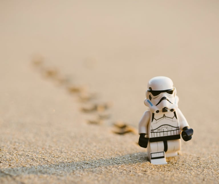
How might we build a casino from the ground up and keep its story intact?
Beginnings
I joined Betsson in 2021 as the only Senior UX Designer. During my initial months, we worked on a major rebranding project, Guts Reborn, gaining valuable experience. However, as time passed and the projects diversified, we hired a web designer, a unicorn between a front-end developer and a designer, to help us deliver many projects, especially the promo pages.
While things were running smoothly, I always felt the need to expand the team. The design team is an amazing team, a bunch of insanely talented people but translating the scope of the project into a ticket was hard, if not impossible.
So we expanded the team by bringing Jessica Azzopardi, ironically from the design team. Beyond having solid product designer expertise, she’s an exceptional visual designer, aligning perfectly with my idea of creating a well-rounded Product Design Team.
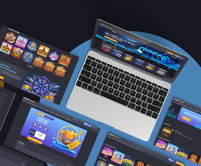
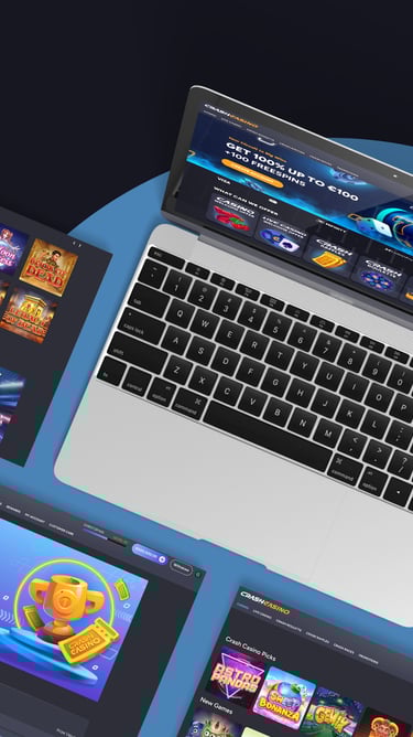
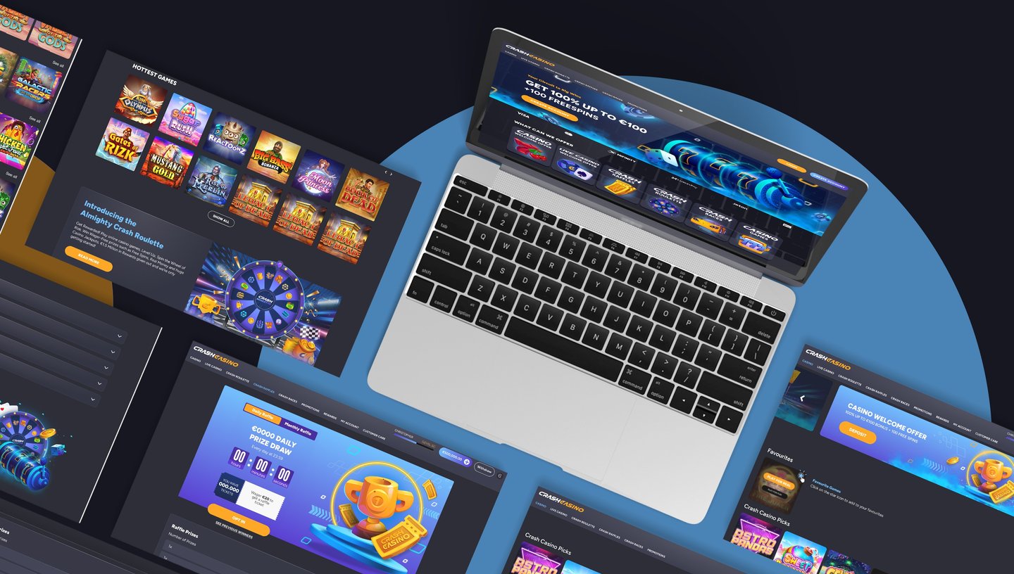
Shaping a casino from scratch
Launching Crash Casino was a big deal for us, and, to be honest, a fun project. We had almost total creative freedom. From the initial discussion I understood that the management is going to trust us with this part.
That meant both opportunities and challenges because even though we didn’t have a brand identity to work with, we would be accountable for all the decisions we took.
All the credits go to Jessica Azzopardi
Defining the team
I believe the best way to grow is by owning a project from start to finish. By making mistakes and fixing them, one can learn why something didn’t work.
While Jess led the design, I focused on structuring the workflow to keep things updated. I wanted to give Jess as much freedom as she needed, but most importantly to provide a fresh pair of eyes when needed.
We’ve all been there: after hours and hours spent on a project, we can’t see a mistake if it’s sitting in front of us, big and written in red.


My responsibilities
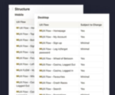
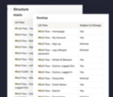
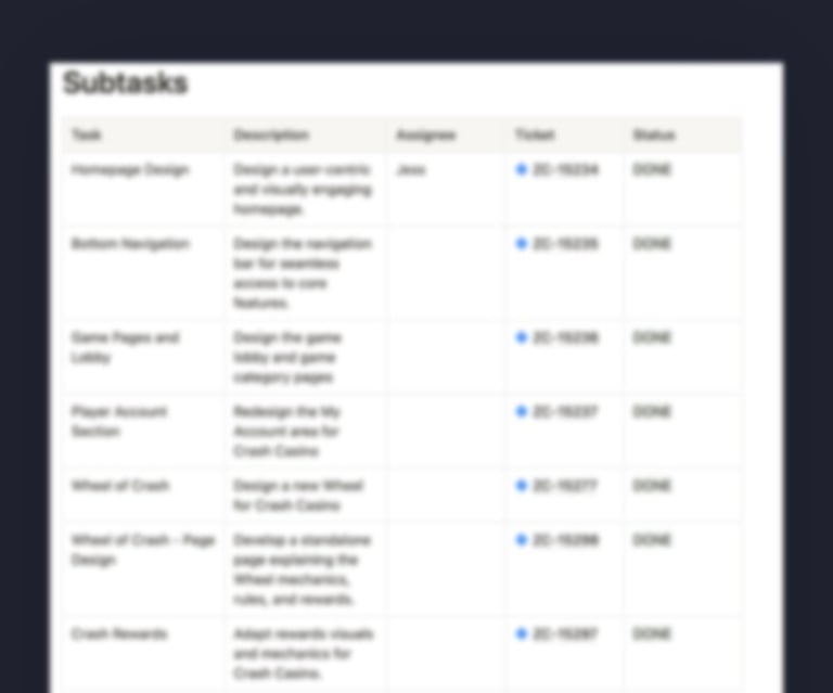
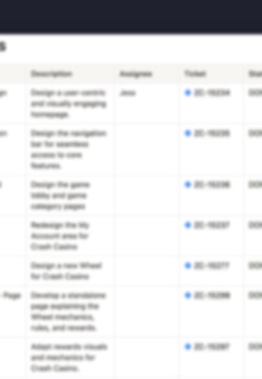
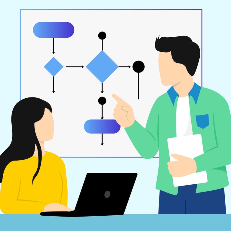
I know that for a project to be efficient, people need to have a clear path to follow. So, I created a Notion page to track everything:
Tickets and sub tickets - We evaluated our upcoming page, trying to anticipate the difficulty of each one
Required Assets - Besides the easily mapped pages, there are many, many, really many extra assets like rewards, tags, etc. This would not have been possible without the help of the devs. Thank you, Julian!
Like in any project, the first 95% of it was the easy part. Now, for the rest, well, I could write another 20 paragraphs. Towards the end, we hit the classic “we need this” frenzy. We had our lists, but there is always something that it’s not there. It’s exactly like a shopping list in a big crowded supermarket on a Saturday morning.
Keeping Track: No Task Left Behind
#1
Jira Tickets - After that, just for tracking purposes, we opened Jira tickets;
#2
#3
Research
Working on multiple brands and aiming for scalability, early this year, we noticed that there were a few problems with our mobile navigation.
The primary navigation was inconsistent between logged-in and logged-out states. Based on the best industry practices, placing it at the bottom left was seen as a smart move, but our players were looking in the wrong direction. It was a classic case of our assumptions hitting a wall.
1.
The Game Plan: A Research with Maze
After an almost 3-hour meeting with a UX Researcher, we were prepared to find the root of the problem. We asked a group of 15 players to test our designs. We gave them a few key tasks to complete:
1. Imagine you're a new user exploring an i-gaming app and are curious about the various betting options available. Locate the main menu and review the available menu options.
2.Did the position of the menu make access easier or more difficult?
3.Which menu position did you prefer (bottom or top left navigation bar)? Please explain your choice.
Key Takeaways
Users overwhelmingly (12 out of 15) preferred the top left position for the burger menu. This is likely due to familiarity, ease of access, and the fact that it aligns with common design patterns in apps. This indicates a strong inclination towards a more traditional menu placement at the top.
The bottom left position, used when users are not logged in, was perceived as slightly more difficult to find, which may suggest it is less intuitive for users.
Player's feedback
"
The location of the menu section took a while to find, but it wasn't really difficult.
"
The option seemed very small and it took me longer to find it.
"
It should be easier, but it's a bit tedious to set the options. The panel is confusing.
Looking back, yeah, we had had a bumpy start. We first stages were very intense. It was like trying to steer a ship through a storm. But perfect projects don’t exist, right?
We started with almost no branding, limited market investment, and a tight timeline. Speed was not only our theme, but our way of working as well. We skipped the perfect design, trying to split our limited time between improving and adapting.
We’ve learned our lessons, and now it’s again the time to roll our sleeves because a new, challenging project is around the corner.
Let’s be honest, nothing is more annoying than seeing a good idea or concept being nicely organised in the digital archive because the a project gets canceled. Business, right?
The best part of this project? We had the chance to get some off the shelves, dust them off and prepare them from a serious makeover! We had some amazing ideas for Guts Races and trust me, it was awesome to see them finally coming to life.
For a while now, we’ve been trying to revamp one of the pages. But, how should it be? A game? A clear info page? Should it be more interactive?
Initially, we experimented with flashy animations and dynamic elements, but it turns out that players weren’t there for the spectacle. They wanted clear and straight answers.
So, our final approach was a clean, and structured page, balancing the visuals and the information.
Bridging Old and New
What if...?
Asset Tracking and Branding Challenges
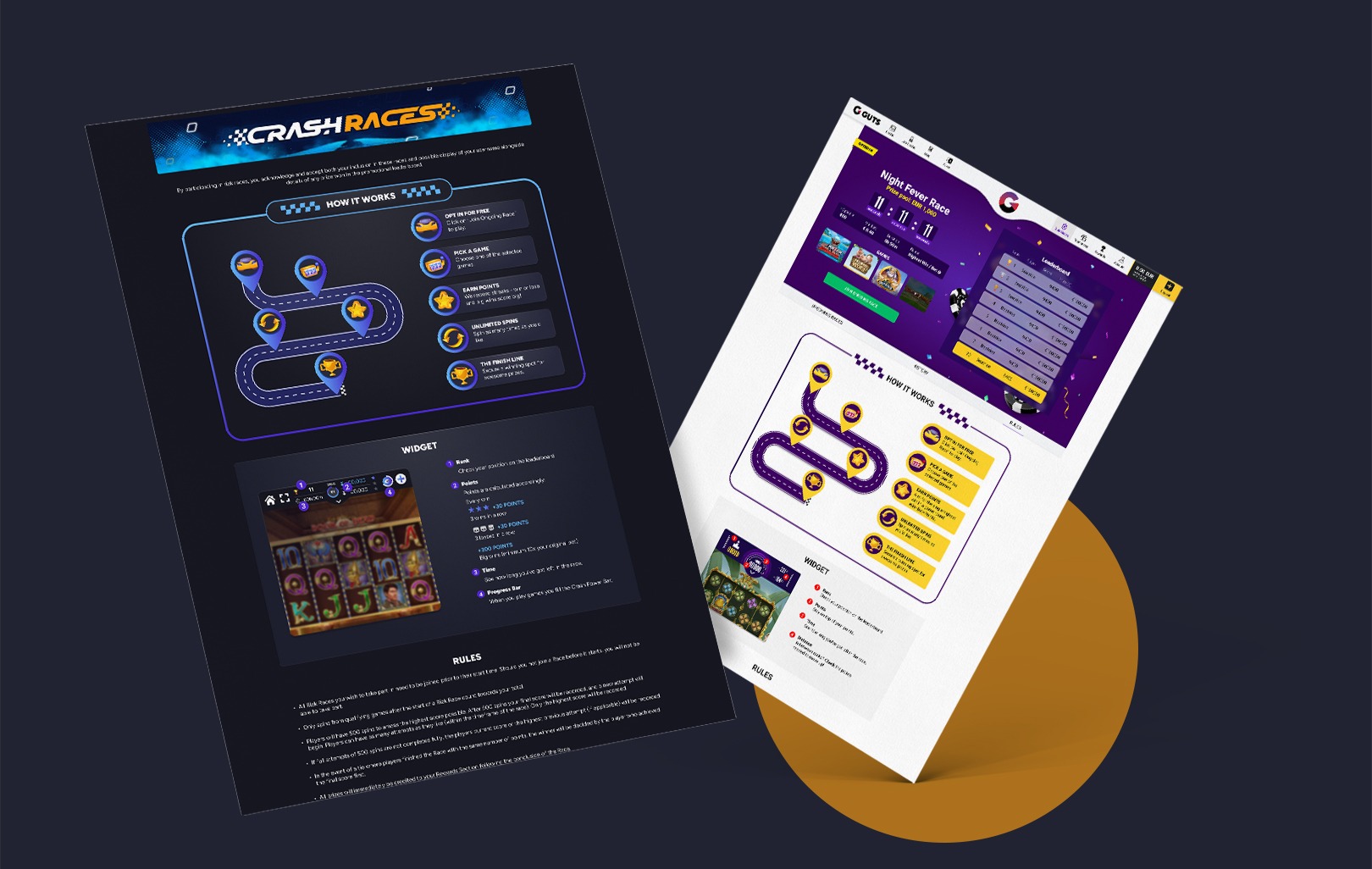
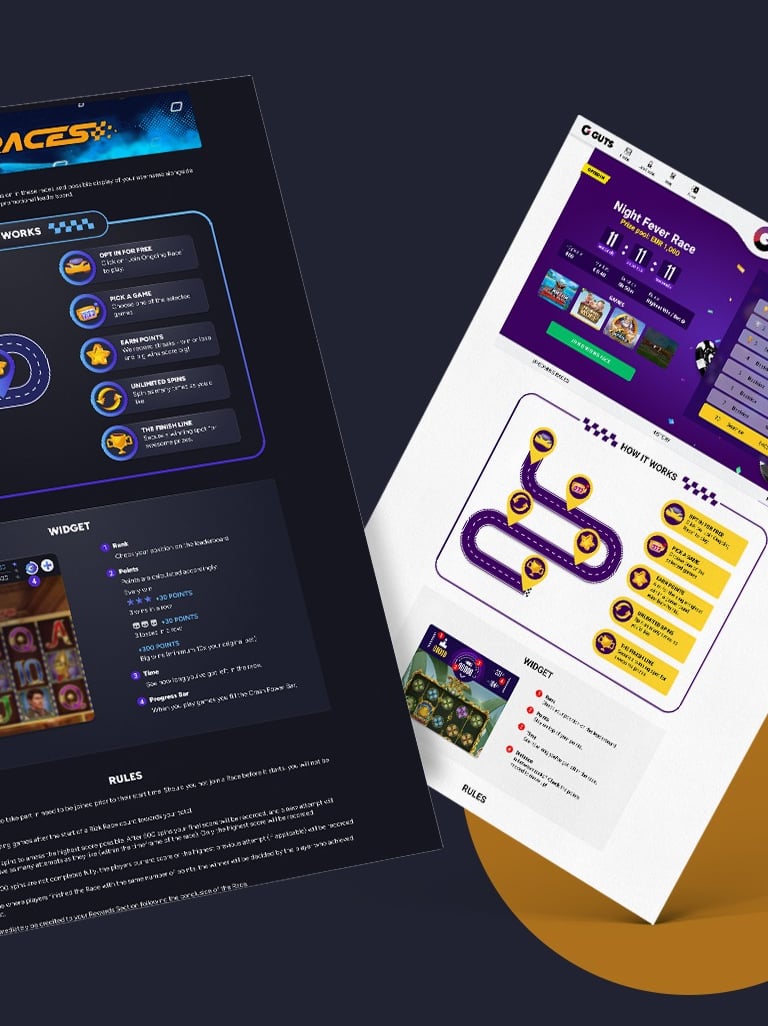
A side by side image of Crash Races and Guts Races, showing how we manage to reuse an old idea
How can we bring new ideas to the table? Our playground.
Design process

It may sound like a cliche nowadays, but honestly, the best thing about this project was teamwork. For a launch of this scale, we managed to start from a few ideas, putting them together and finally creating a brand new casino.
This wasn’t another casino launch, it was the foundation of a design system that we are ready to scale to multiple brands.