OUR GOAL WAS TO MAKE A DIFFERENCE
We've taken Guts to a Fresher, Brighter, and Bolder level. Now, the addition of two new prizes isn't the only reason to spin.
Upgraded Style. Upgraded Rewards. All the more reason to play.

How might we make Guts fresh, modern, and relevant?
Before the brand refresh.
Setting the stage
In 2021, Guts was in front of a crossroads: continue the current path or face a revamp. Luckily, chose the latter. While it had a good reputation and a loyal base of players, its design and gamification started to feel outdated. Known for its bold approach, Guts was on the verge of losing its identity.
During this process, we wanted to visually update the interface, improve or bring new features, and add new gamification elements, while keeping the core values alive.
Problems
After the initial enthusiasm of being part of such an amazing project, I realized how much work actually needed to be done. And, of course, the soft launch date was sooner than expected.
This meant getting my hands dirty. I had to build a bridge between the key stakeholders, trying to understand the company's vision, and the other departments to understand how much work had been done.
#1
Do you remember the glory days of 2012? Back then, the Samsung Galaxy S3 was the peak technology (wow, can you believe it?). That's when Guts first launched, with a desktop-first approach. It was a different era.
Let’s now fast forward to 2021. The mobile landscape has changed leaving Guts feeling a bit… stuck in the past. Our internal benchmarks indicated that the ratio between desktop and mobile users should be around 65-70% to 25-30%. However, with Guts, the ratio was down at 55% desktop to 40% mobile.
Ouch.
Clearly, our mobile offering was not compelling. This was a significant gap that needed addressing urgently.
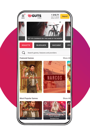
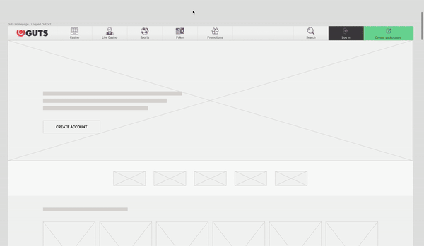
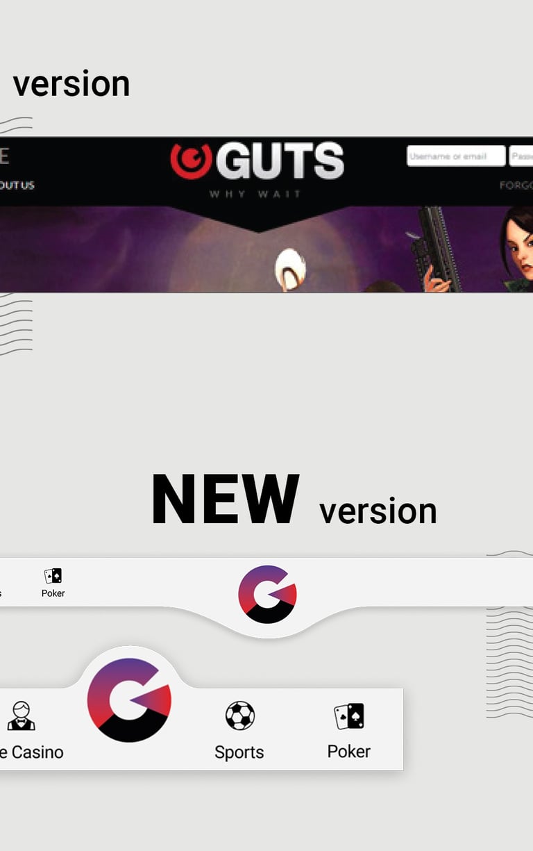
The logged-out casino page before the rebrand
#2
Guts initially made a strong impact in the market with a clear and bold brand identity. However, as the industry evolved, so did the expectations of our users. The once-cutting-edge Guts experience began to feel disconnected from the modern player's desire for a dynamic and engaging casino.
Here's the thing: outdated doesn't just sting, it becomes downright embarrassing. So much so, that it started to look even more outdated than its initial release.
It was time for Guts to ditch the shoulder pads and mullet hairstyles and find a brand identity, closer to the modern day.
The homepage before the rebrand
#3
An inconsistent design breaks the user experience. Players expect a fun and engaging journey, but when design elements are inconsistent, the flow is affected and it causes only frustration. Imagine navigating a casino website that looked like a teenager's bedroom.
This wasn't just an aesthetic nightmare; it was a usability disaster. Users expect a smooth ride, a seamless journey that takes them from browsing games to cashing out. But Guts' inconsistency left them confused and frustrated. (Seriously, why was there even a bike on that page?)
If it wasn’t clear until now, Guts needed a major overhaul.
The logged-in casino page before the rebrand
Mobile Version
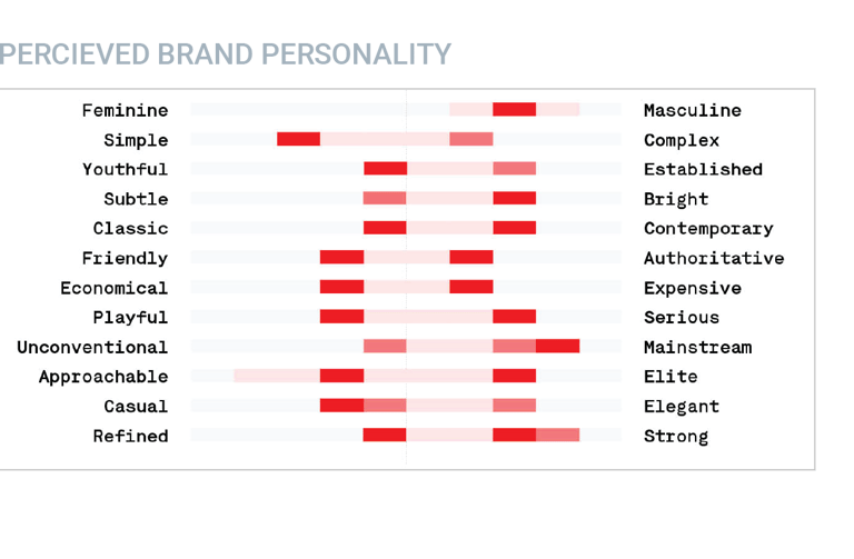
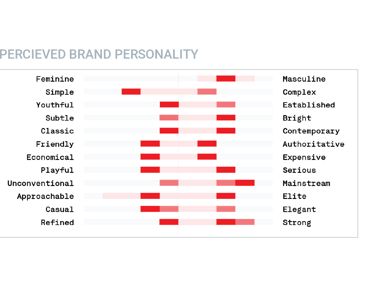
Brand Perception
The Smartphone
Goals
The Value of Core Products
Guts had a full list of great products, but they needed polishing to shine, much like our school awards. From our meetings with the stakeholders, I understood that we need to build our brand around our three major USPs: Fast Payments, amazing Customer Support, and locked Withdrawals.
Efficiency
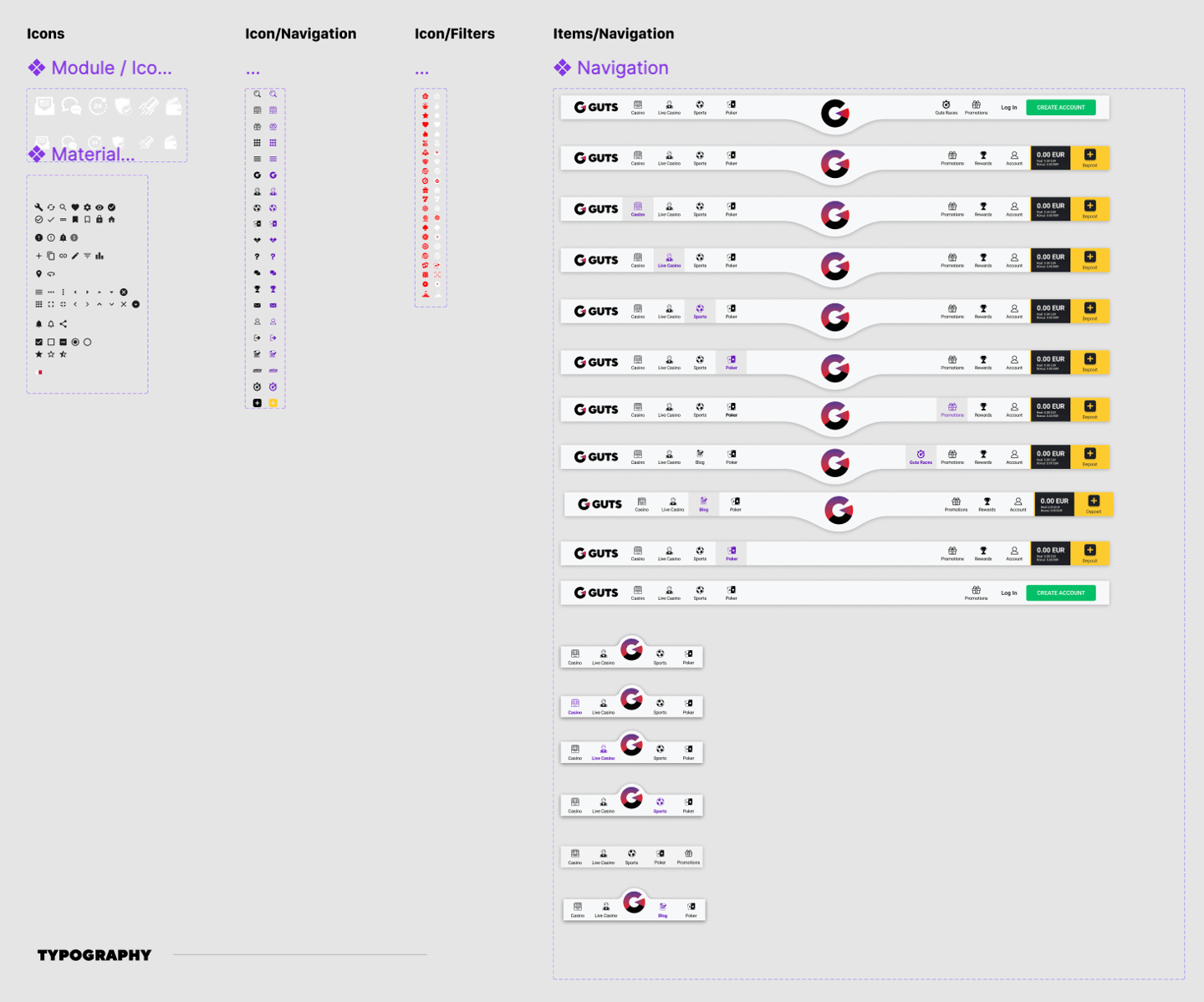
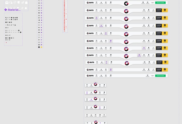
To avoid past mistakes, we’ve started building a design system. We aimed to create:
Reusable components for buttons, cards, fields, tabs, etc
A simple typography and color scheme for brand consistency
The initial stages of the Core Components Page
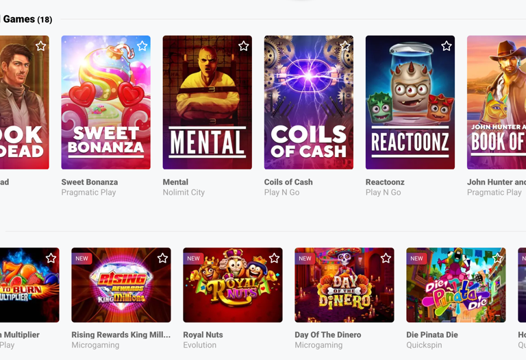
The "playlist", showing the games they'd love the most.
#1
#2
Relevant Content
Guts players have their preferences for games. We focused on creating a “playlist”, showing them the tracks (or, in this case, games) they'd love the most.
Consistent Experience
No matter where a player entered from, we wanted to create a smooth and enjoyable journey across all devices.
User Goals
Business Goals
Research
We all have our GUT feelings, and initially, we relied heavily on them. But for anything to work, we needed to be in alignment. After all, while exciting hunches don't always lead to buried treasure. For a successful user experience, we knew data-driven insights were crucial.
Through a research mission that included internal surveys and competitor analysis, we gained an understanding of Guts' users and their needs. This user-centered approach informed the design decisions we made throughout the project.
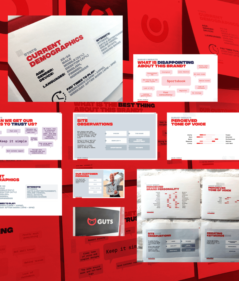
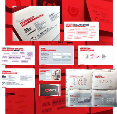
Initial Research Board
Who are our players? What do they want? How can we improve the experience?
External feedback
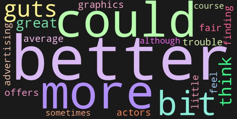
To understand what our players are saying, we analyzed feedback from before and after the rebrand. That involved opening a CSAT score on our website, inviting our users to share their experience, anonymously.
Once we gathered more than 50 answers, we started sorting the information. This data will allow us to compare the pre-rebrand experience with the new one. We can look for changes in player satisfaction, identify which new features are resonating, and pinpoint any areas that still need improvement.
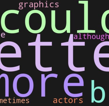
☹️I think you have great graphics, but I'm having a bit of trouble finding the offers you're advertising.
"
a little above average..
"
I feel Guts is a bit more fair than most other casinos, although sometimes Guts could have been better, of course!
"
What our customers say
Similar to our internal reviews, Guts wasn't a bad casino. The real problem was it was just... meh. It was stuck in a random, neutral place. Looking back, we weren't fixing something broken, but trying to push it to something great. When a brand is 4, there's a clear path, but when it's a 7, well, that's when things get complicated.
Internal feedback
Now that we’ve met the Team, let’s have a look at the design process, the heart of the story. Buckle up, because this wasn't a walk in the park. It was a tour filled with trials, errors, experiments, and a few unexpected plot twists.
We all had our awkward years, didn't we? There was Guts too, when our design journey began. Our journey began with big, ambitious ideas. These early concepts were all about exploring layouts, information hierarchy, and user flows.
Even from the early stages, we presented the product concepts, trying to user experience with the company's new business goals. It wasn't easy, but we had to find a middle-ground.
As we refined our ideas, the new identity started to take shape. This moment marks the moment when our character truly began to come alive. We played with color palettes, typography, and visual elements that reflected the brand's bold and adventurous spirit.
During our initial discussions among ourselves, we noticed a curiosity toward a classic, dark theme, so we decided to try this approach.
Early internal testing, however, threw us a curveball. Out of 10 people asked, only 2 preferred the darker version. This proposal was dismissed mainly because of the fear of creating something totally different, confusing our players.
We also tried different approaches to improve the overall experience. For example, we removed the traditional carousel on the homepage, opting for a different approach, with cards and a quick registration form that should integrate seamlessly with the revamped registration (no spoilers for now!)
Early Ideas
The redesign process was collaborative and iterative, involving feedback to ensure we were aligned. During this process, I worked closely with:
Developers: Supporting the entire process from beginning to end;
Branding Teams: Updating the new visual identity while maintaining the brand's values;
Bridging old and new
Guts has its loyal fans, the true rock and roll diehards! We knew we couldn't let them down. We wanted to give them a little something special, a way to reconnect with the Guts they knew and loved.
How did we do this?
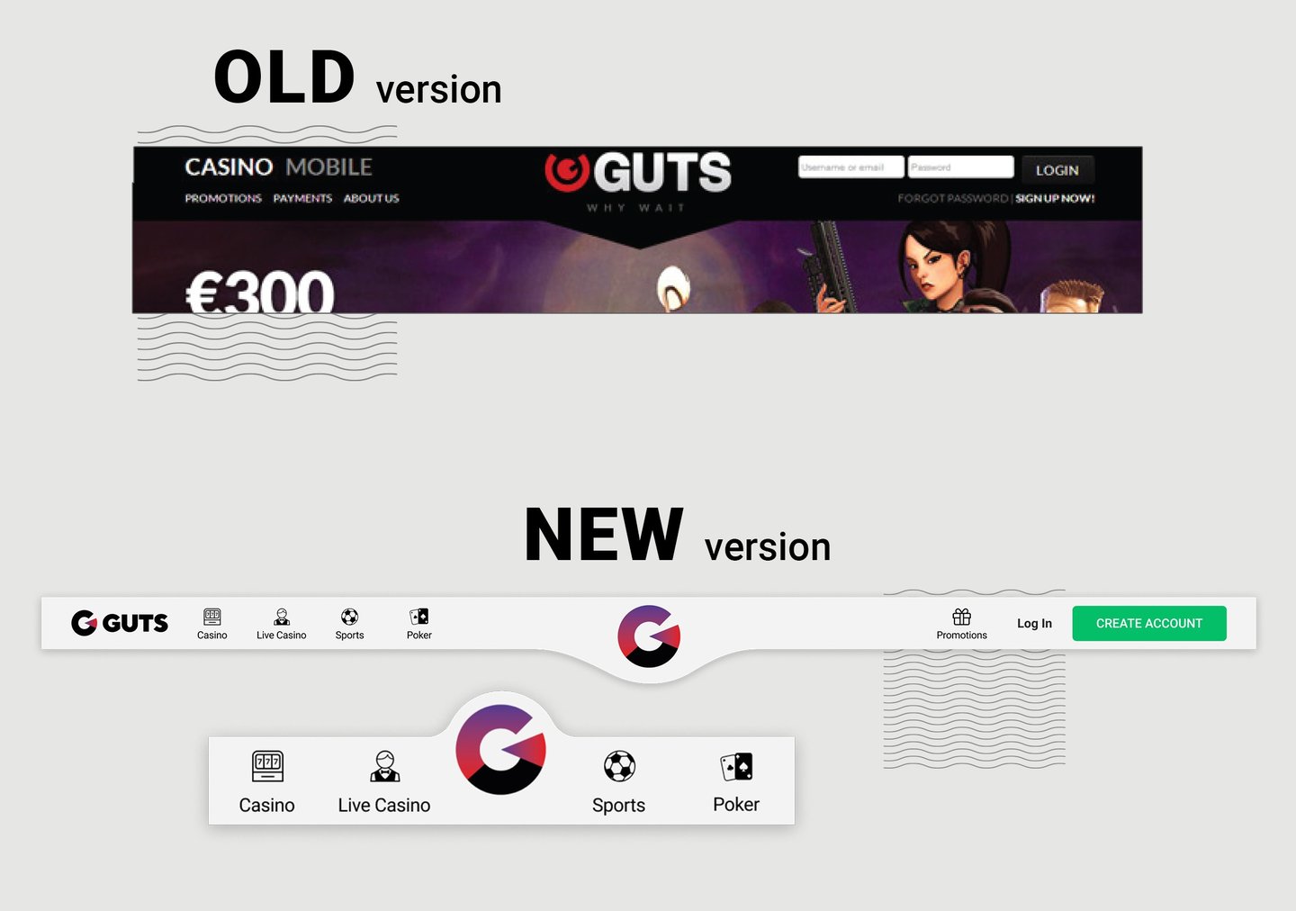
We decided to reintroduce the small "bump" at the top of the navigation. It's a subtle nod to the past, a familiar tune brought to the modern times.
What if...?
Examples of our different visual approaches.
The initial files of how the project looked.
The inspiration for the new navigation.
A different interaction approach to the classic carousel.
Initial phase
Design Process
Still Guts… where old meets the new
Back to feedback
Remember our feedback from our players?
☹️I think you have great graphics, but I'm having a bit of trouble finding the offers you're advertising.
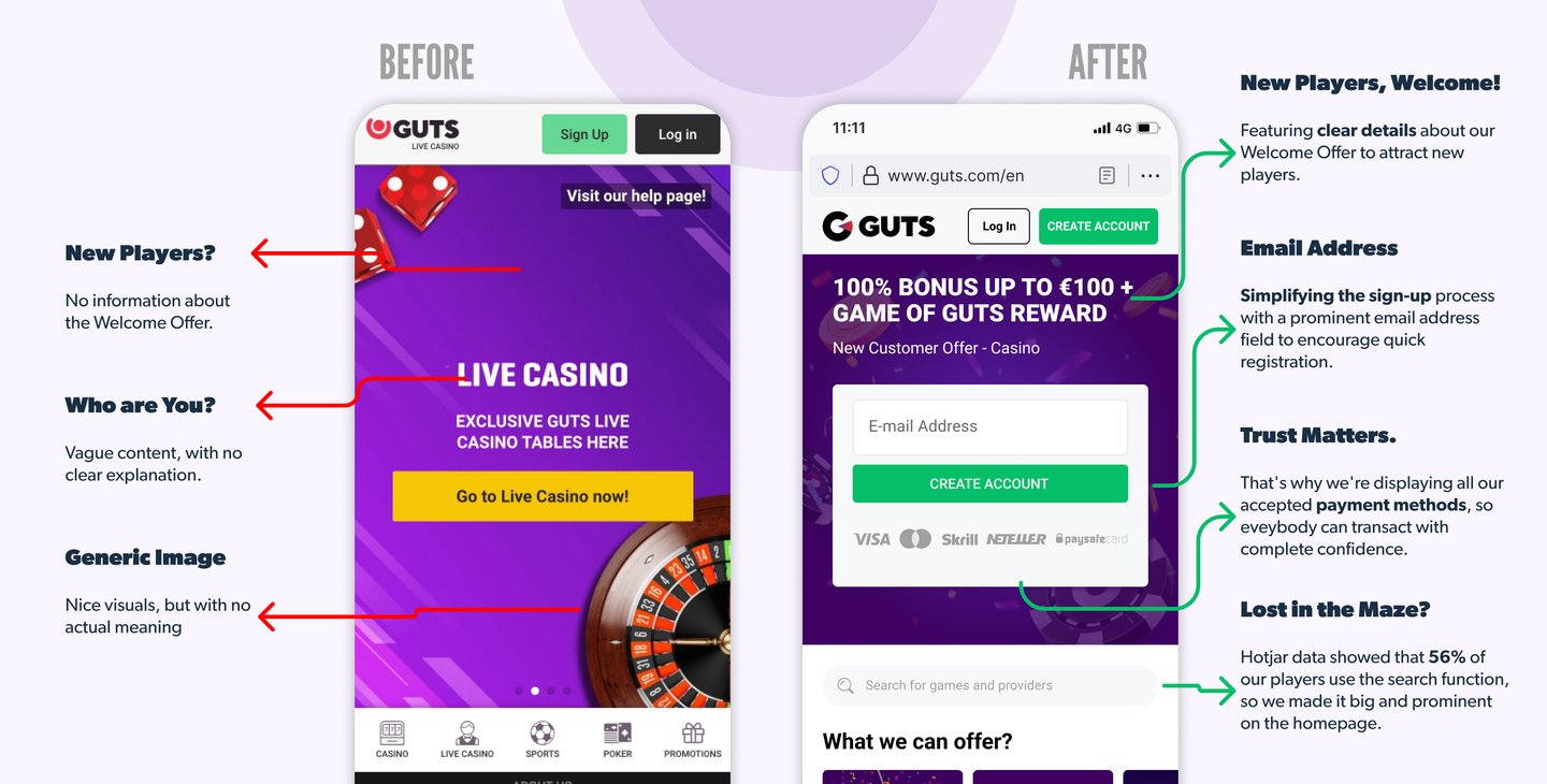
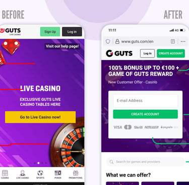
We noticed it as a recurring theme, so this insight directly informed our redesign of the casino's promotional banners and the navigation. We've introduced a new section that highlights our offerings and main promotions, removing 5 images.
From rough sketch to refined experience
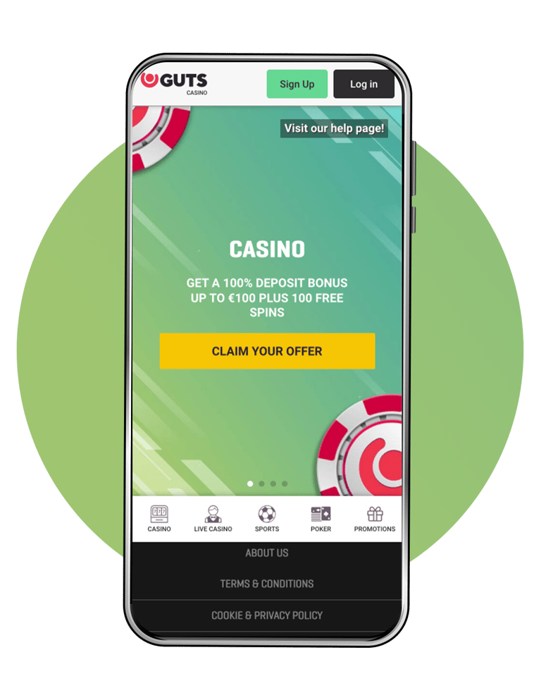
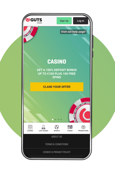
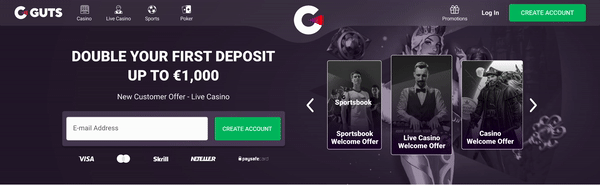
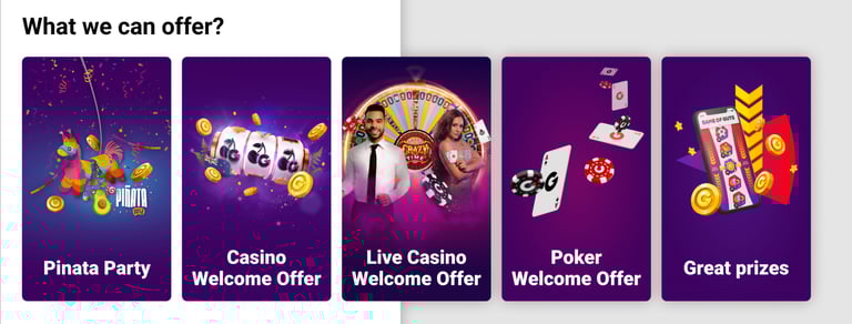
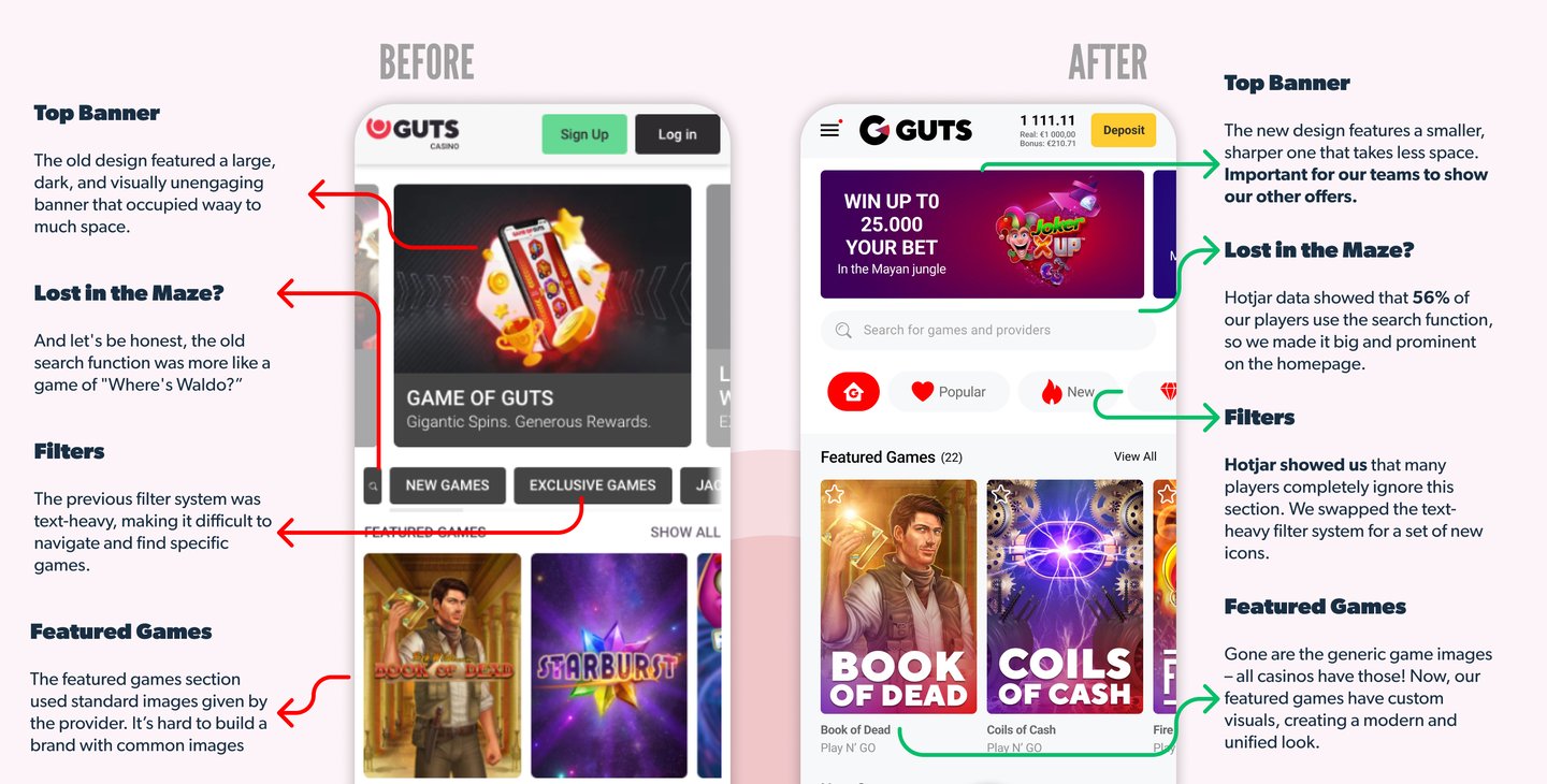
We changed the old design, focusing on what truly matters: making a casino journey effortless! Simplified signup, clear payment methods, and a search powered by user insights (data showed that 56% of our players are using it). New players are welcomed with a prominent offer.
I wish I could show you every single part of the process! All the early mockups that we did? Many great ideas, but they definitely need more time in the oven.
This project wasn’t just about a new layer of color, we added features that matter most to our players, hoping to improve the experience. We helped Guts transition from the awkward teenager phase to a rock-star phase.
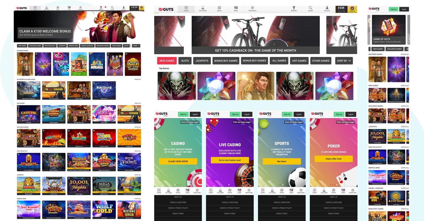
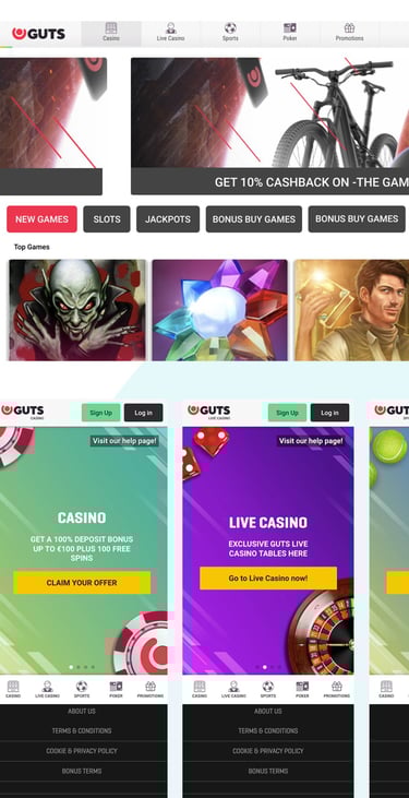
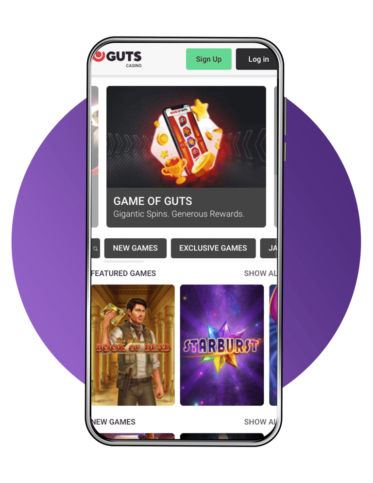
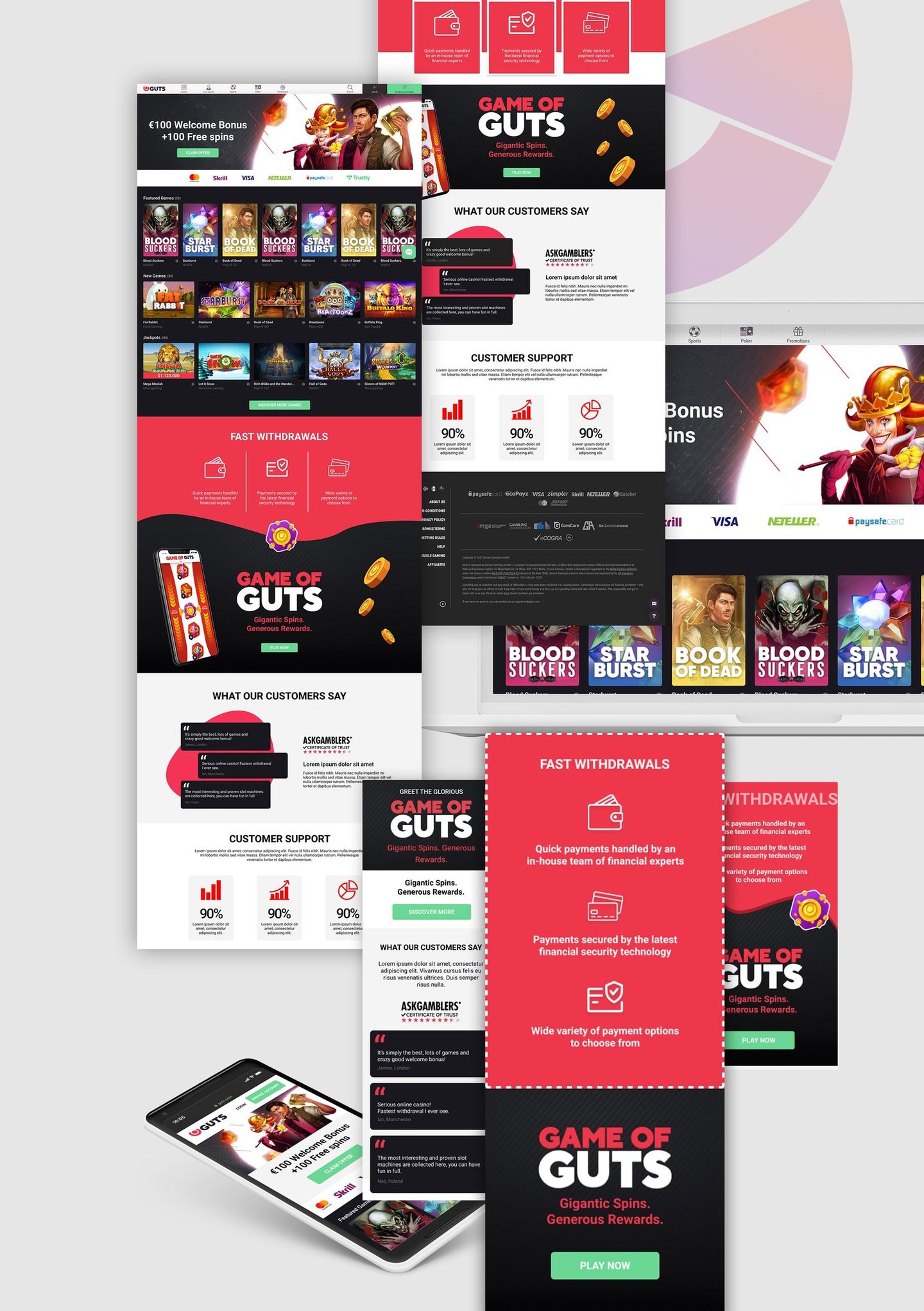
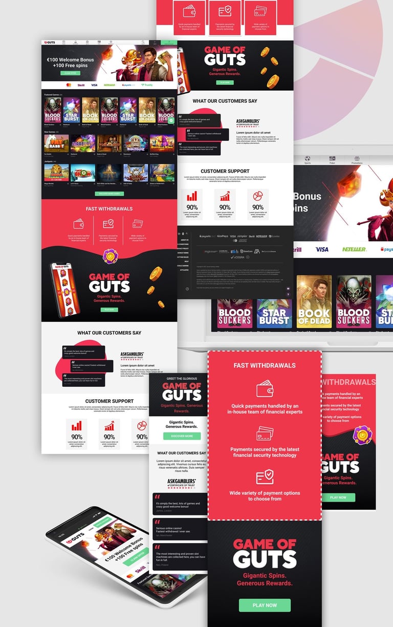
The improved Homepage
There's more to see here...
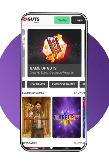
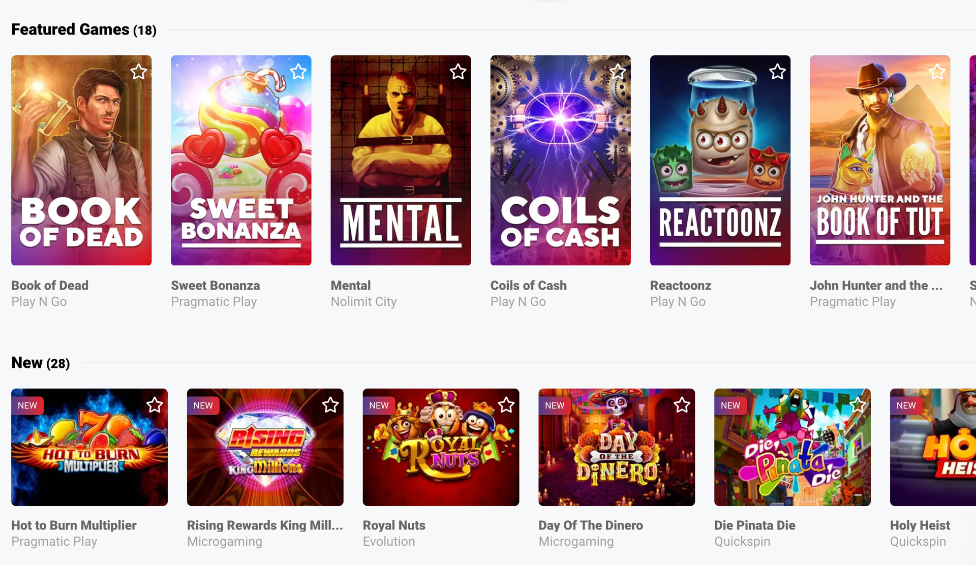
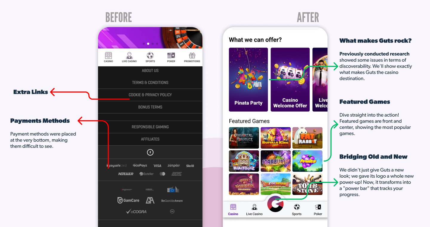
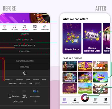
Not only did we revamp Guts' appearance, but we also showed what makes Guts rock, and featured the most popular games...
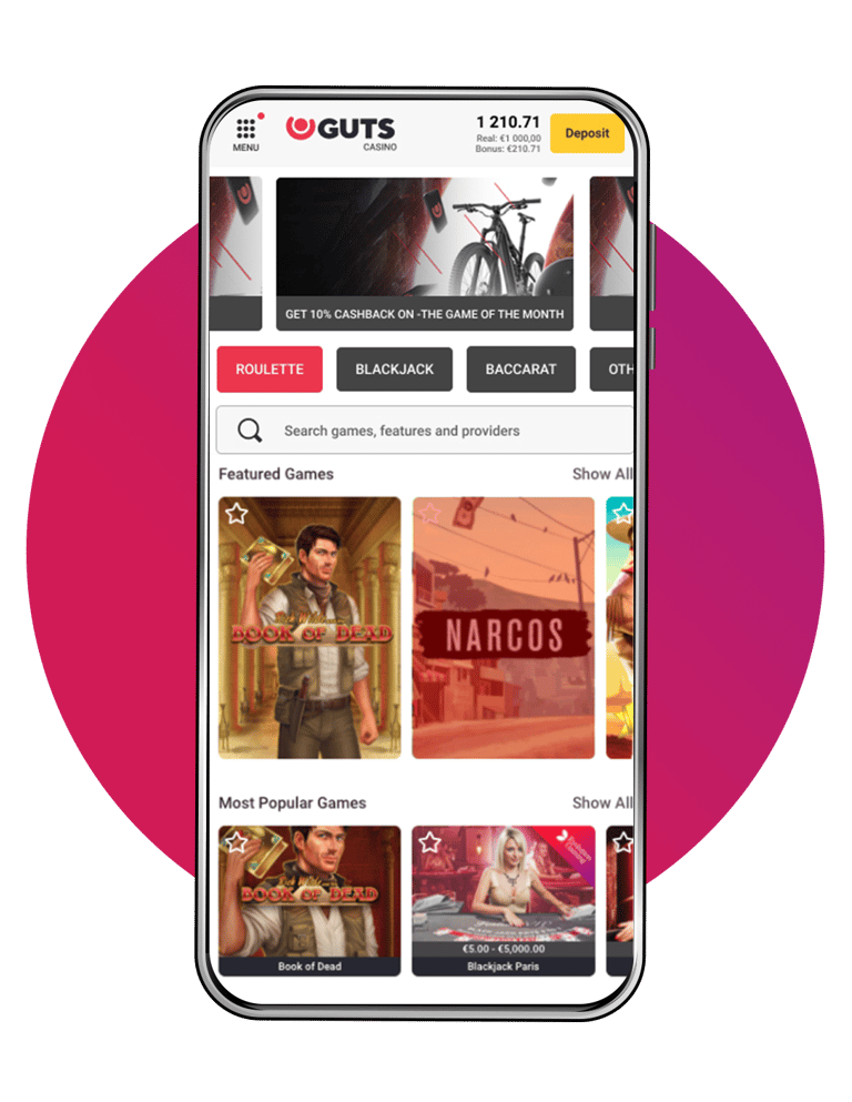
But the real diamond? We transformed our logo into a dynamic "power bar" that tracks your progress. This isn't just for aesthetics, it's a mobile-friendly gateway to the entire Guts future gamification system. With a single tap, you can check your level & unlock epic rewards
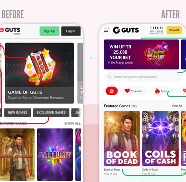
The Casino Page
The old casino page felt like a bad rock ballad, long, dark, and forgettable. Guts Reborn changed that design, replacing it with a smaller, more visually engaging banner, a search button that's no longer a "Where's Waldo" challenge, new filter icons for smooth navigation, and custom game visuals.
These improvements are more than cosmetic changes. They're a user experience game-changer, making the casino page effortless and engaging, so the main focus should only be on what really matters the games!
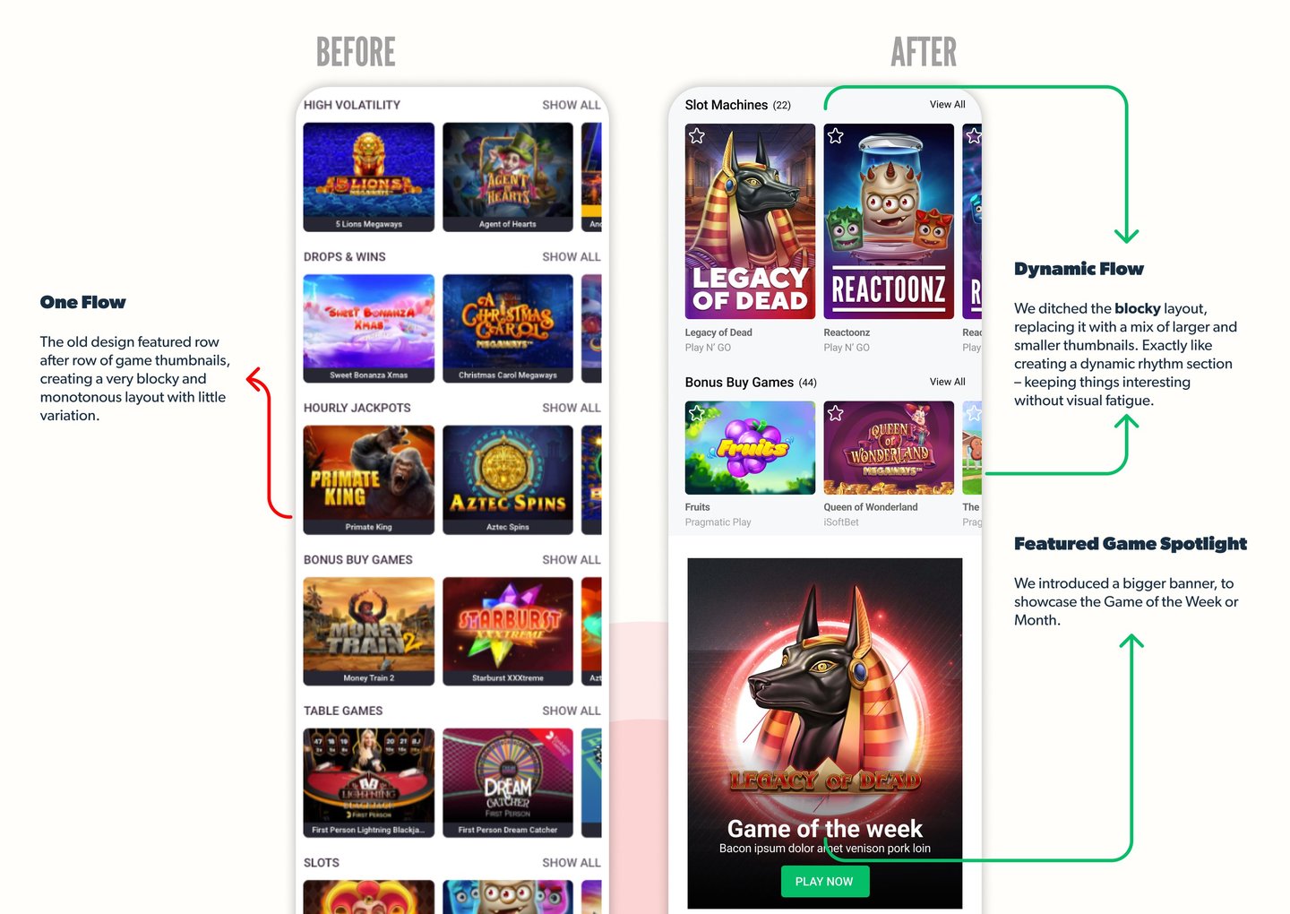
More games, less mess
Guts Reborn removed the old game library's boring flow. We introduced a bigger banner to spotlight the Game of the Week and mixed larger and smaller thumbnails for a dynamic flow.
When Credits Are Due
All the amazing visuals, banners, and icons that are part of the new Guts homepage? Everything is thanks to our amazing design team! An amazing and talented rock stars.
What about our copywriters? Each word was carefully written because, well, the music wouldn’t be complete without the perfect lyrics, right?
They helped us create content that blends perfectly with the images, ensuring that each idea hits the right note. You guys rock!

We tested a new sign-up approach, showing the Welcome Offers in a new way, offering the possibility of quick registration (spoiler alert: 6% of new users took advantage – not bad!).
Now, for the numbers that make our hearts sing!
121%
Takeaway time
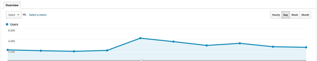
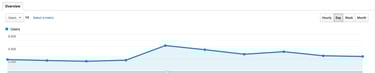
increase in active users on launch day, (a truly glorious day!) And after a few days, it was still holding steady at a cool 30% bump. Boom💥
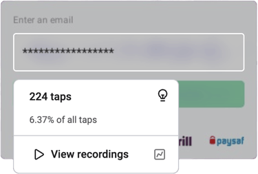
The Suspect: A Trust Gap?
Our Hotjar investigation showed an intriguing detail: users were spending a lot of time reading the Terms & Conditions and all our legal terms. Our hypothesis? A lack of trust. People weren't convinced that Guts was a trustworthy casino.
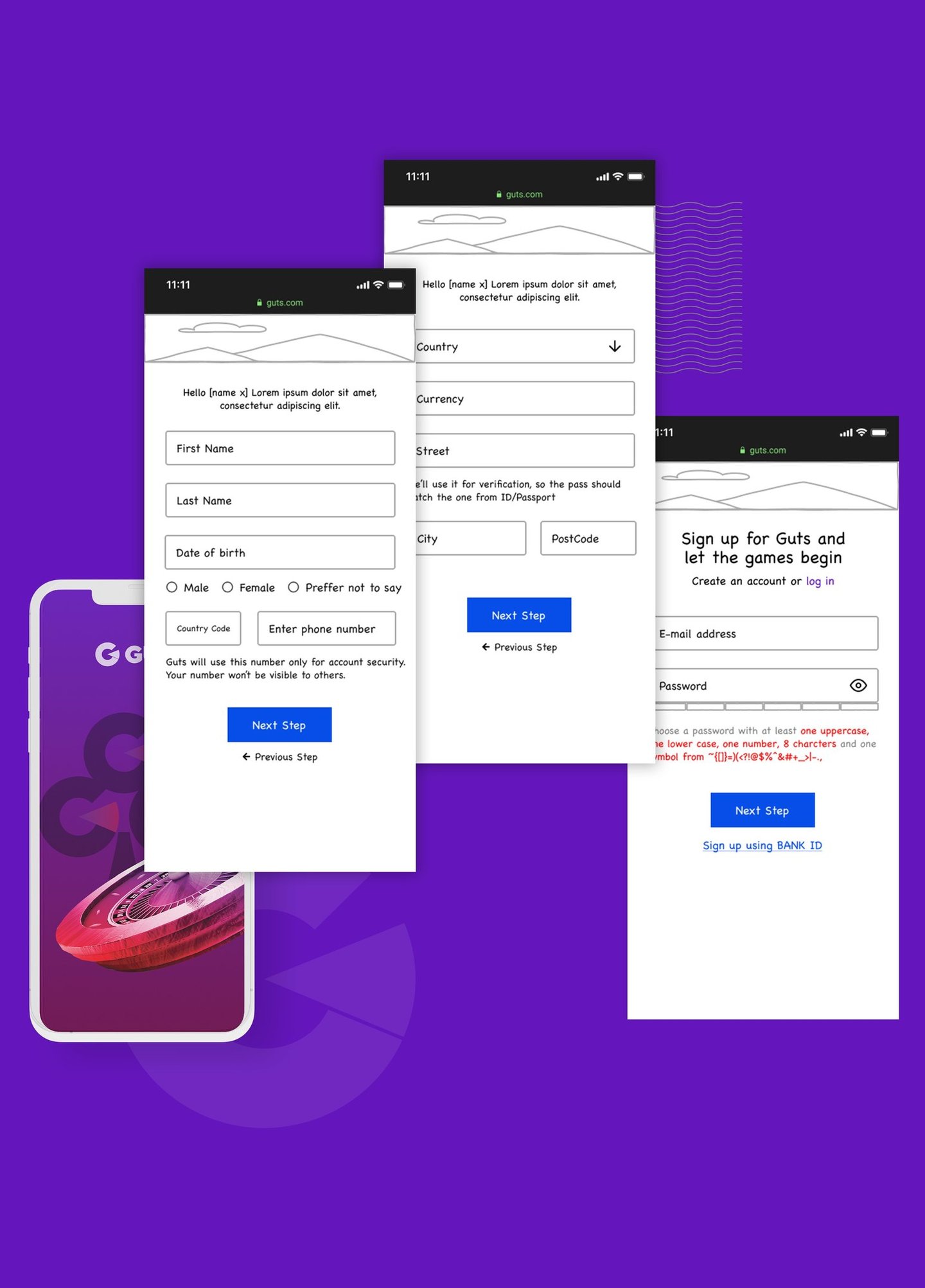
Operation: New Registration
It was time to crack the case! As we were discussing this issue among ourselves, a Senior UX Researcher told us a story from her previous company: someone had removed the security icon from the registration because the icon didn’t look good. And guess what? The numbers went down! Crazy, right? How can such a small change have such a big impact?
We needed a new approach. We changed the information architecture, focusing on a conversational tone, mimicking the natural flow of getting to know someone. First, the name then, perhaps the address, so details would be revealed gradually, aiming for a sense of trust.
We then asked ourselves, how many fields to include on a single page? More fields meant less need to jump between steps but could clutter the experience. Fewer fields meant an easier process but with the potential drawback of requiring additional steps, especially on mobile devices.
Everything seemed to be going well with the Guts rebranding. But hold on, there's a plot twist! What did you expect? Things to run perfectly? During our meetings, we discovered a new challenge: a drop in new registered customers.
Case closed…or not?...
Through these efforts, we successfully increased new user registrations by 6%.
How the sweet taste of good results made us push further!
Results Are In!
Want to know more? Dive into the detailed steps of the presentation to see how we cracked the case and continue to refine our approach.
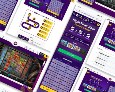
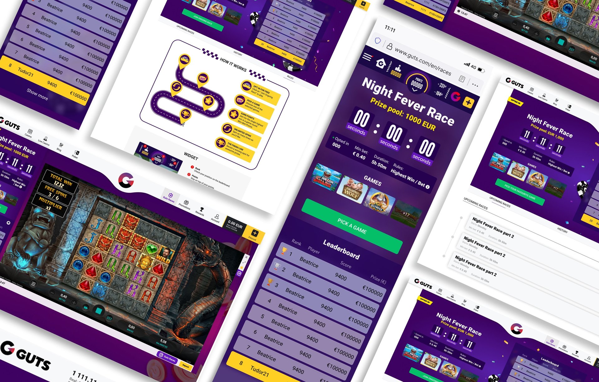
Fasten your seatbelts for Guts Races!
While the sign-up revamp was a major win, there's always more to do! We're currently in the works developing a new feature: Guts Races. Imagine fast-paced tournaments where players can compete for exciting prizes!

The story of Guts is a continuous journey. It is a long process that, from now on, will be part of our team’s collective effort.
We’ll continue to check our user's behavior, conduct A/B testing, and constantly iterate to ensure Guts remains up to date.
This project has been a fantastic opportunity to showcase the power of product design and collaboration. Nothing would have been possible without an AMAZING team and a true passion for this brand.
As for me, the narrator my biggest lesson was how anything can be fun when you collaborate with talented people, and bring to the table all that’s good from each department.