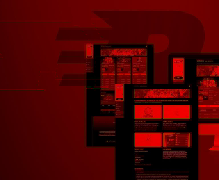
RESEARCH. PROTOTYPE.RIZK. RACE!
We've supercharged Rizk Races with a racing-inspired redesign, putting the player directly in the cockpit.
Expect a clean hierarchy, a real-time leaderboard that gives you constant feedback, and an interactive accordion widget that gives you total control.
Setting the stage
Fasten your seatbelt! We're embarking on a new journey to redesign the Rizk Races.
Rizk is already a fan favorite, but why miss the opportunity to add even more excitement? The concept of Rizk Races was born from the idea of a dynamic, competitive environment for our players. The purpose was to move away from the traditional experience into a race, "where every spin counts and every win or loss, brings you closer to the podium"
This wasn't just about adding a new feature, it was about building engagement and rewarding our most loyal players.
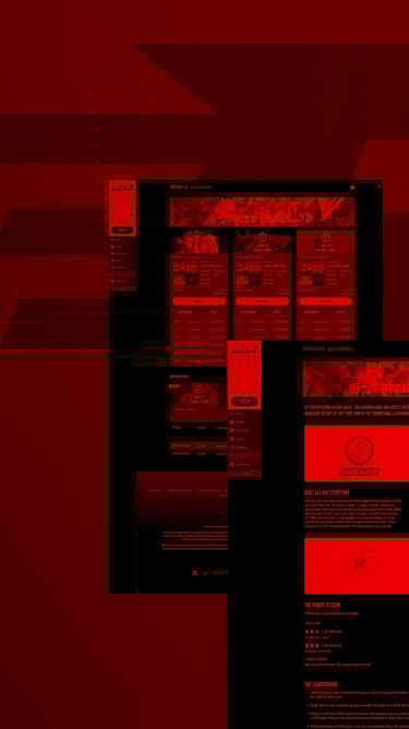
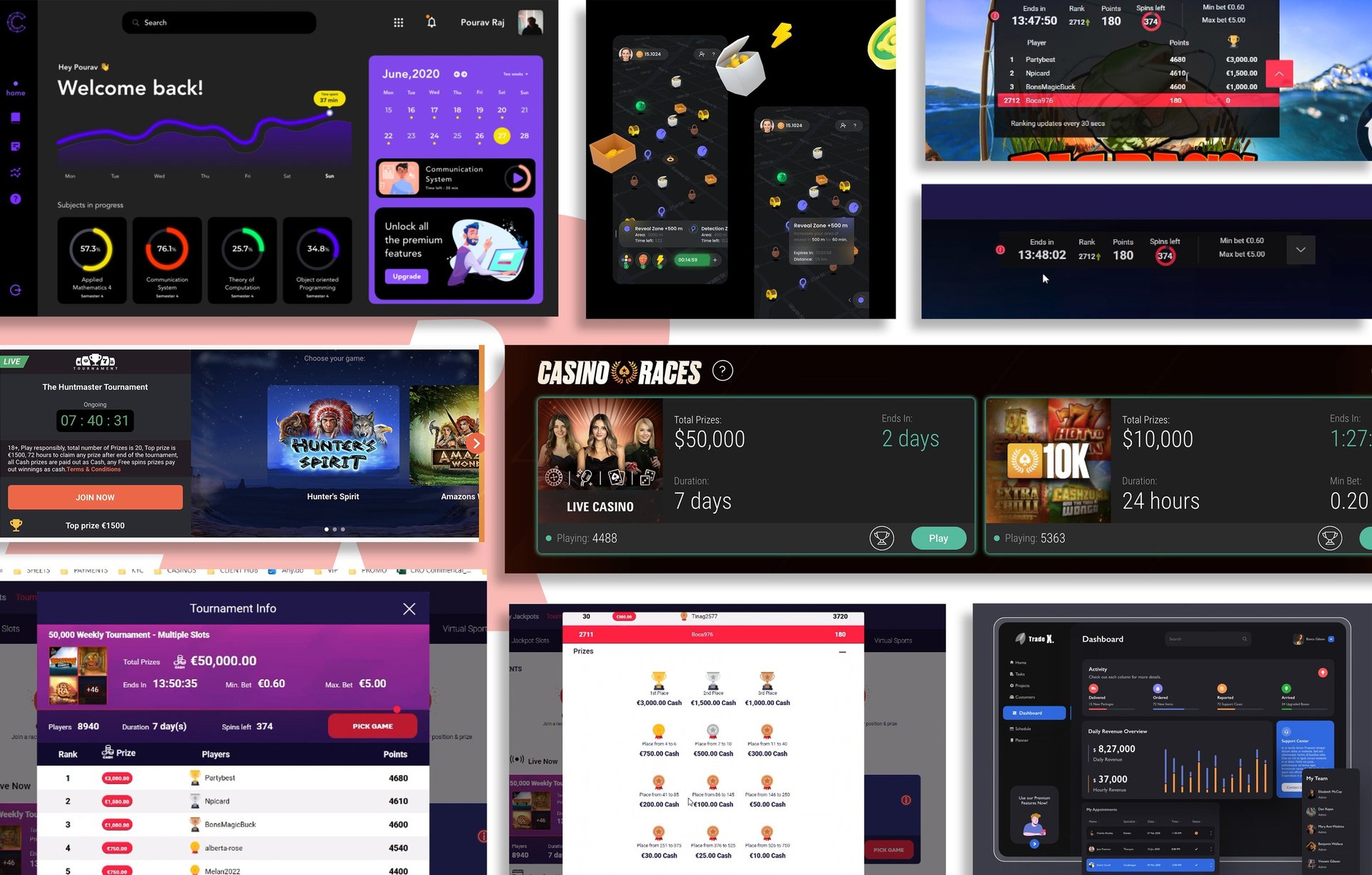
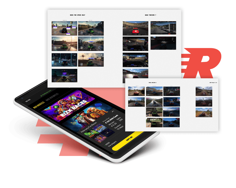
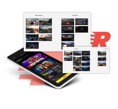
Examples of how Races used to look like
How might we bring the race car feeling to our widget experience?
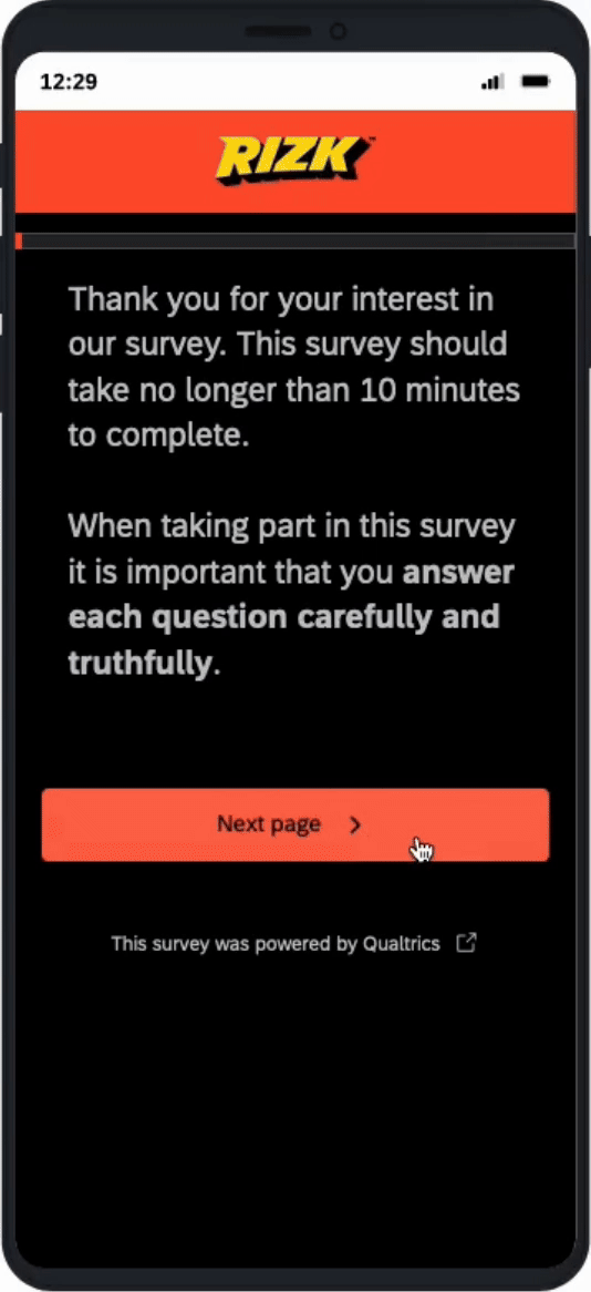
Together with the UX Research Central Department, we conducted an online survey using Qualtrics to measure the overall performance of Rizk against some key factors. It serves as a precursor for further investigation and research.
Type of questions
1.How easy is it to navigate within the website?
2.How easy is it to find what I'm looking for on the website?
3.How easy is it to make deposits via the website?
4.How easy is it to explore the website more?
Research
It's a number's game
For the magic to happen we had to collect around 385 responses. We budgeted 2 weeks and prepared comms to remind people who might have missed the original send-out.
Results
One recurring detail from our insights was that players weren't finding all the necessary information easily. We needed to simplify the layout and create a clearer path for our players.
Competitors analysis
Analyzing our competitors' websites taught us a lot about user expectations for tournaments. We understood how the layout is organized and how the information is presented. At the end of this exercise, we understood what players value the most.
Even from the beginning, our main concern was how to present the data in such a way that anyone would understand it. Our canvas was as large as our phone screen. We wanted to show everything, but in the end, we realized we couldn't do it.
By conducting an additional investigation using Hotjar, we identified a recurring problem: user anger. "Rage - clicks" were a clear indication that people were struggling to find the right information.
Problems
#1
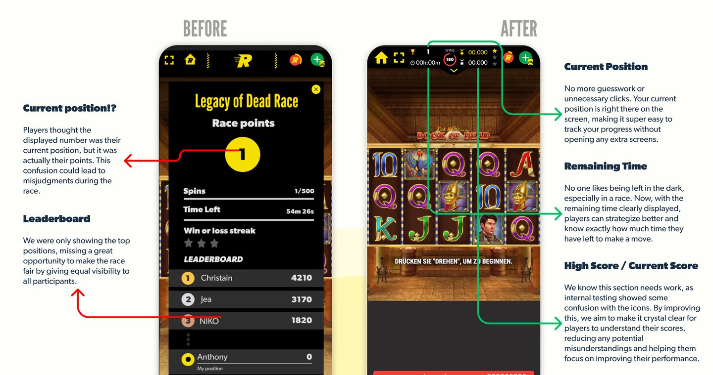
No Visibility of Progress
The lack of any leaderboard made it difficult for users to track their performance;
#2
Game Mechanics:
Accessing this information required them to exit the game entirely, creating a frustrating disruption;
#3
Navigate the interface:
Switching between different games within the interface proved to be a challenge for users;
Redefining the race experience
Imagine the excitement of a race, the adrenaline pumping as you are reaching the final meters with the finish line in sight. Whether it's a high-speed car race or a sprint to the finish line, the essence, the thrill remains the same. That's the exact feeling we wanted to capture in the Rizk Races.
Our goal wasn't just a visual refresh. We wanted to mirror the raw essence of a live race and translate that energy into the user interface.
Our challenge was clear: how could we make Rizk Races more intuitive, engaging, and seamless for all users?
From concept to creation
Also, we used racing video game HUDs for inspiration. We wanted to understand how we could capture the excitement and the thrill and deliver it back to our players.
The existing design resembled a chaotic starting grid, where important race details were hidden or very difficult to find.
Who's on the starting grid? What drives them? What fuels their passion?
Design in progress
Our initial approach went for a minimalistic approach, prioritizing a simple interface. We focused on a clean hierarchy, highlighting the race position and remaining time, hoping to mimic the driver’s cockpit.
Prioritising Minimalism
Looking for a middle ground, we want back to the drawing board, looking for a balanced version. We incorporated the missing information, but internal feedback showed us that this version was missing readability because of the low contrast.
In our pursuit of a better solution, we experimented with different approaches. Unfortunately, we encountered a detour on the 3rd iteration. While trying to simplify the information, we ended up doing exactly the opposite: overcomplicating it. The changes resulted in an even more confusing navigation.
This "wrong turn" taught us the importance of maintaining a clear and logical informational hierarchy.
All the previous mistakes served as a valuable lesson, and with that knowledge, we arrived at the final design. While it might not be the most visually striking interface when compared to our initial attempts, it prioritizes what truly matters: usability. Lacking the screen estate of a TV or a monitor, we incorporated the missing information, leveraging most of the explanations on icons.
By conducting more tests we managed to refine the interface even further. Using a high-fidelity Figma prototype, I noticed one important insight. While the functionality was on point, people hesitated to click on the widget, fearing it would take them away from the main game, thus losing all the progress.
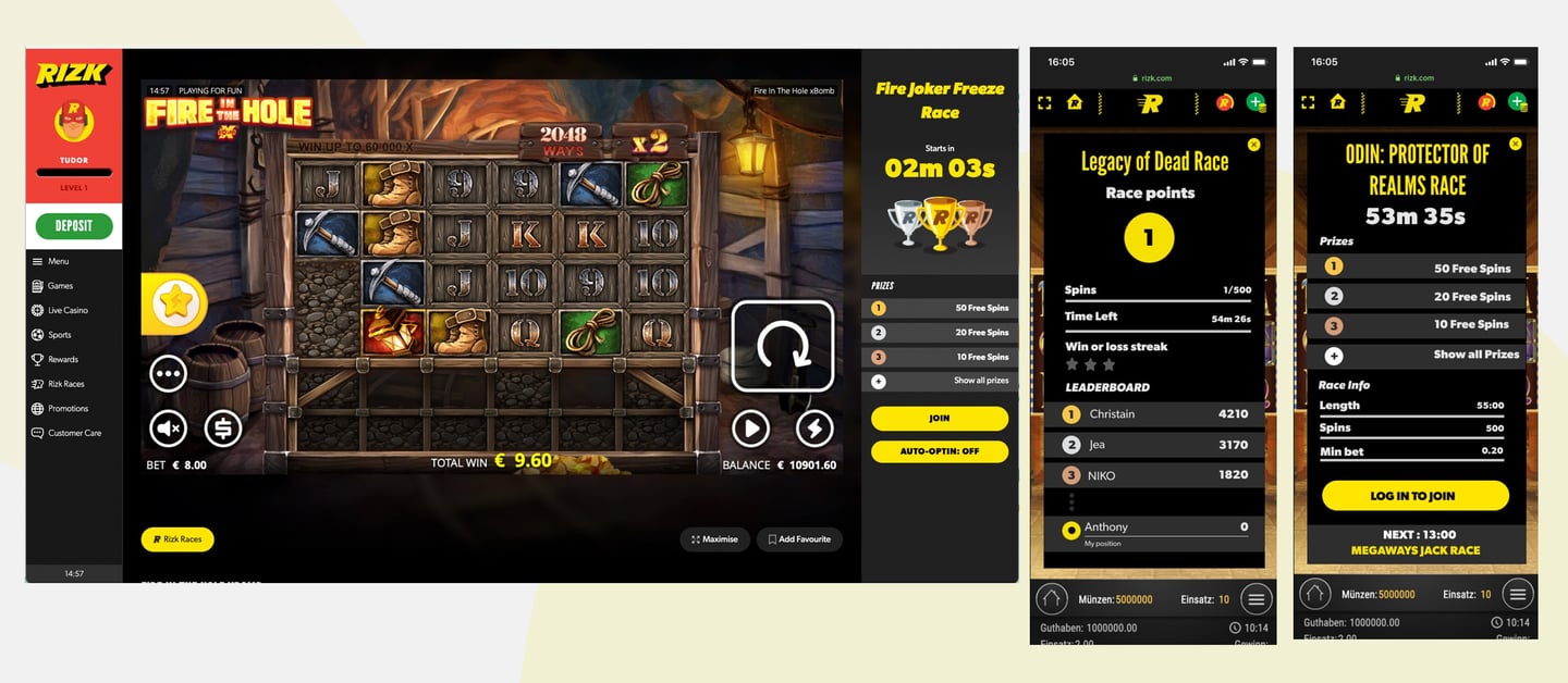
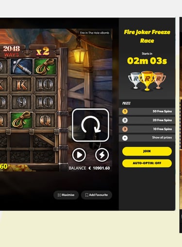
We addressed this issue by implementing a clear design element that indicated the widget's interactive nature. This subtle change transformed the widget into a user-friendly "accordion" that expands to reveal all the information upon clicking.


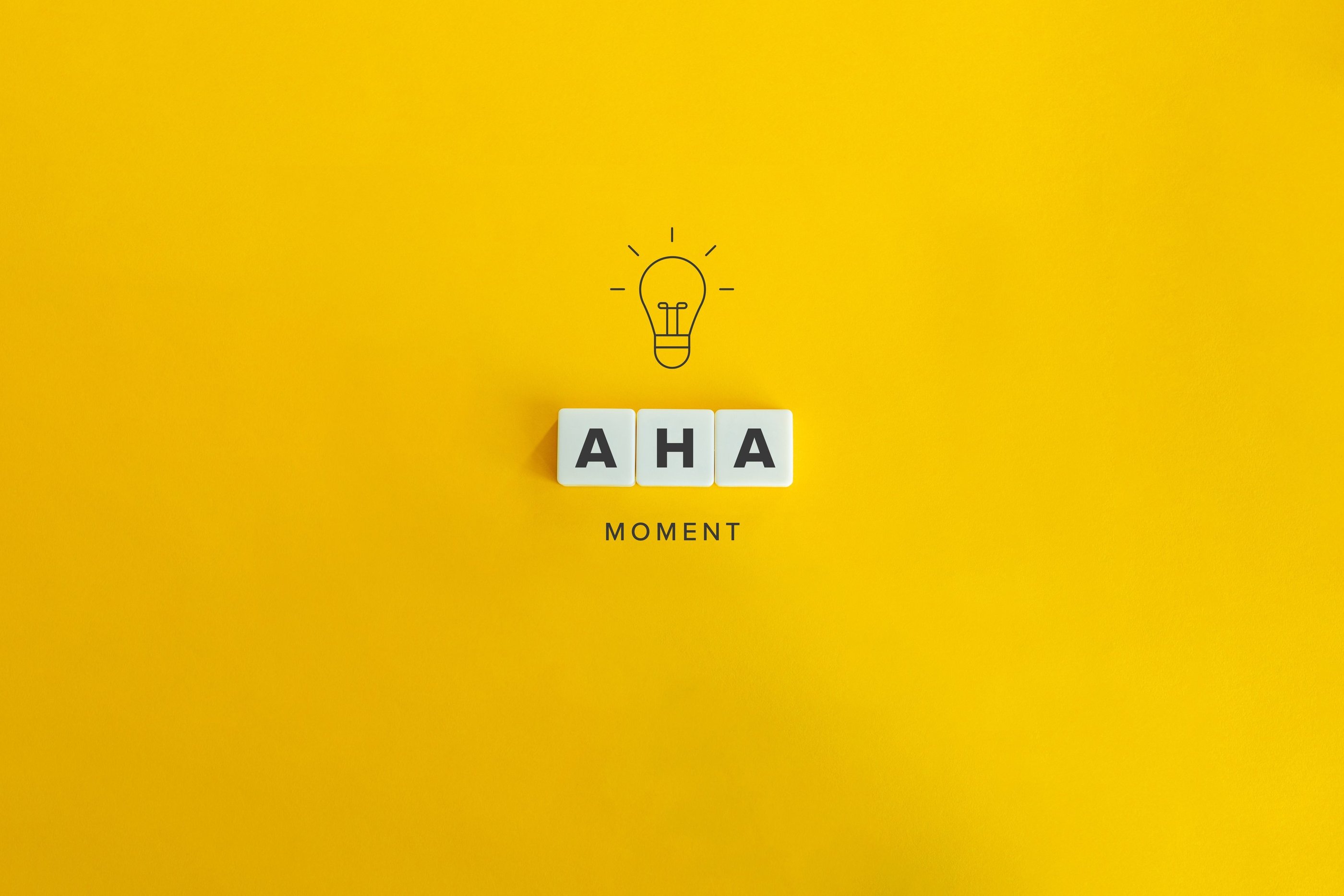
The Aha Moment: Function Over Form
Here's where we hit a bit of a speed bump. While the initial idea had enough information and it looked nice, it lacked some features that a player might need.
Essential information like game rules and time details were missing, like forgetting your helmet before the big race!


1. Clear Information: All the essential race details are presented in a well-organized manner, making sure that players can easily find what they need.
2. Intuitive Navigation: A clear and logical layout allows users to easily navigate through the races and participate with ease.
#1
#2
Balancing Beauty and Usability
#3
The Final Lap
#4
The Wrong Turn
Key Elements:
User Testing and the Winning Formula
Closing in on the finish line, lap by lap
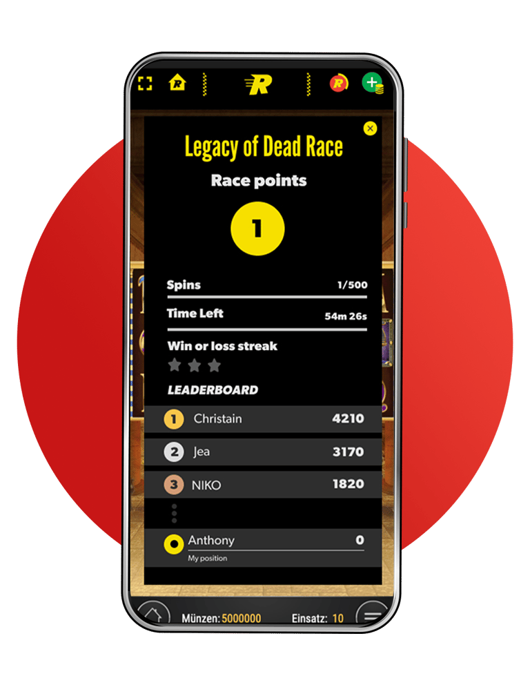
The Podium Version
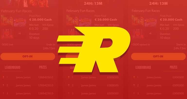
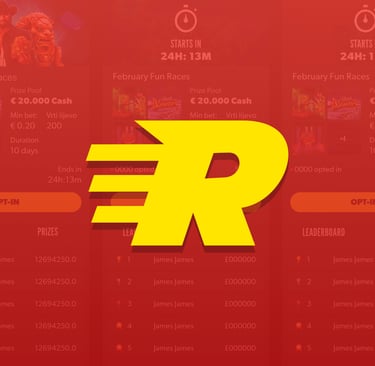
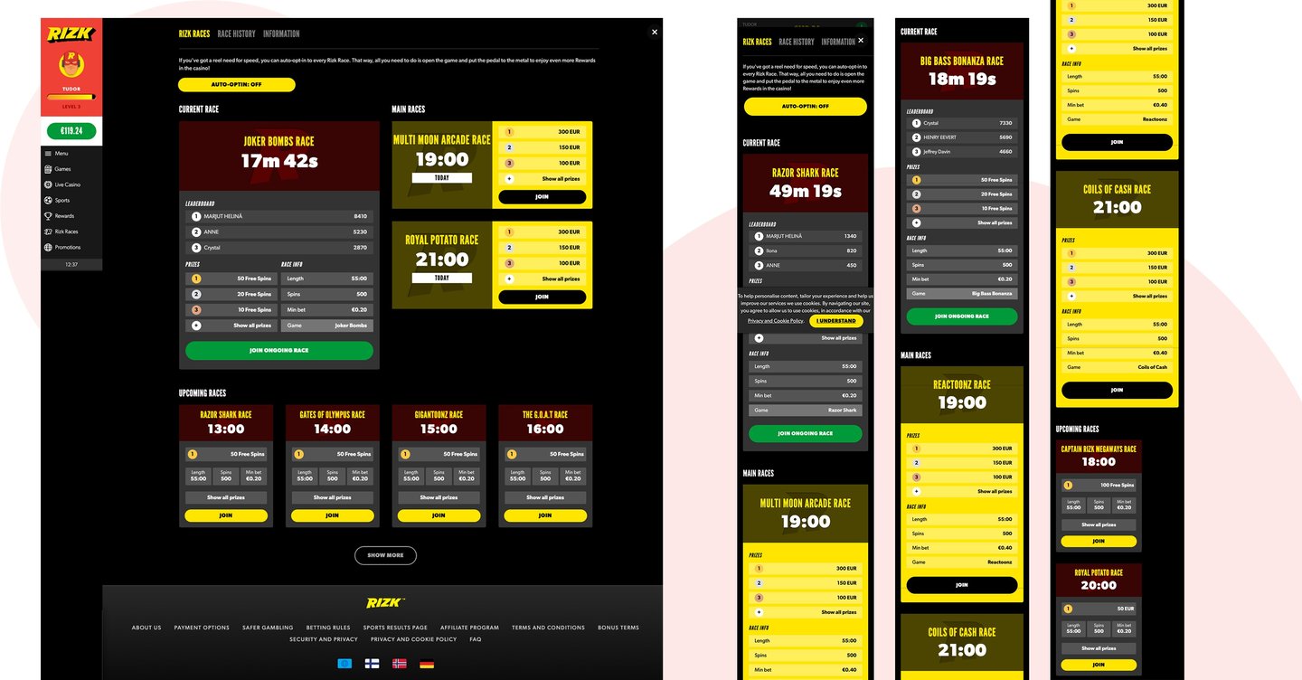
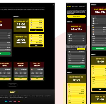
The rizk races design
We changed the old design, focusing on what truly matters: offering our players a race experience. We went with clean navigation, giving users just what they need when they’re not racing. No more clutter, just pure, focused content.
The initial version of Rizk Races resembled a chaotic racing track. The functionality and the mechanics were there, but it lacked the polish for a top experience.
We followed the "form follows function" rule, focusing on the features that truly mattered, ensuring that every design element would improve the experience.
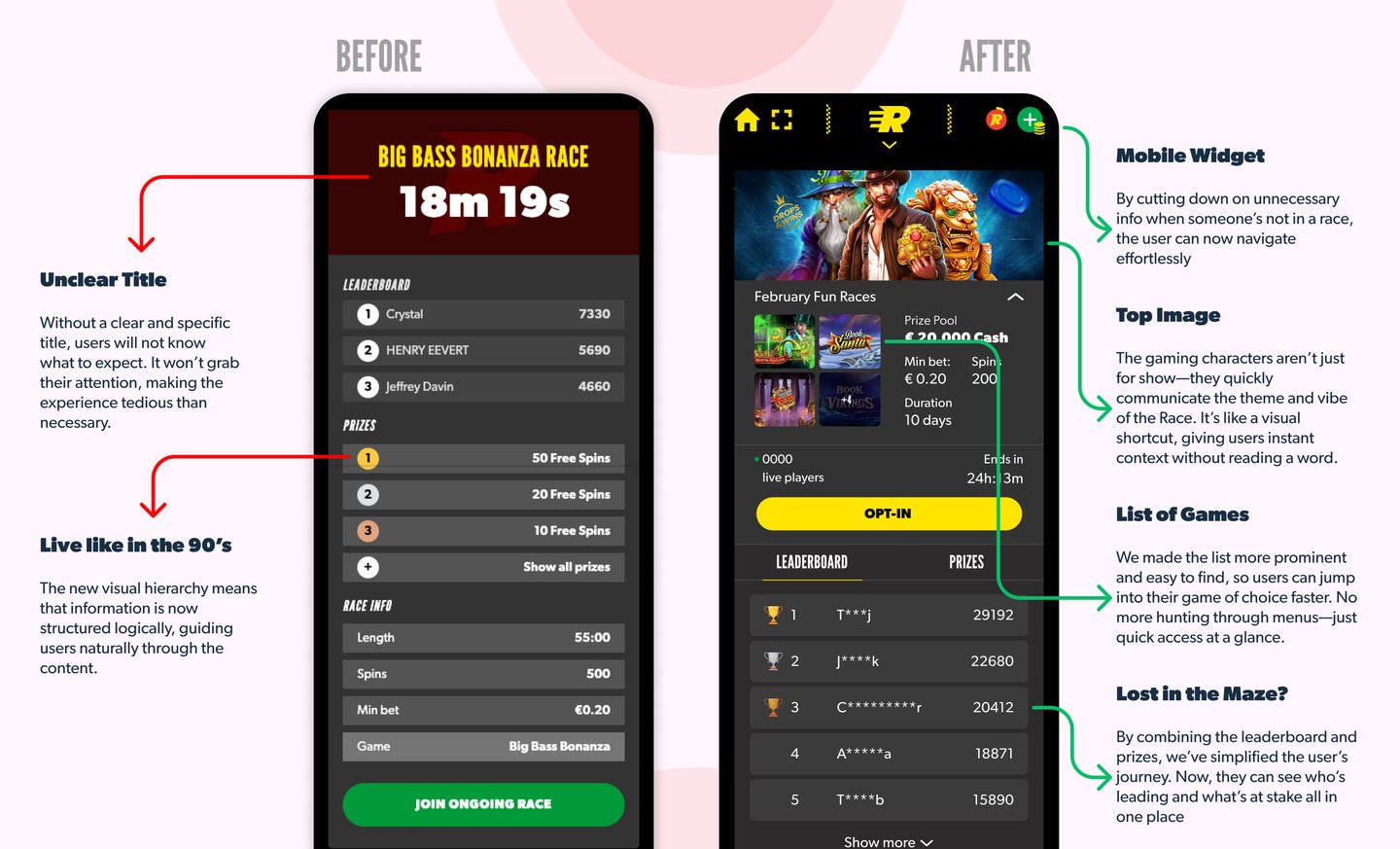
In the past, only the top positions were highlighted, leaving the other participants in the shadows. We’ve changed that by displaying all participants on the leaderboard, ensuring everyone has visibility. This not only promotes fairness but also motivates every player to stay engaged, knowing they have a chance to race to the top.
Just as a pit crew, this project had an amazing team behind it. Starting with a vision from the country manager, our dream team made this possible. From the designer, copywriter, devs, and CRM, everybody did their part to turn this into a gem.
The improved Race Page
Fairness for All Participants
When Credits Are Due

This project showcases the iterative nature of product design. By failing and constantly testing and refining based on user feedback, we were able to transform the Rizk Races from a confusing maze into a valuable gamification.
This redesign allows users to fully immerse themselves in the race experience, or the game, without the need to pause and go back to check the information, without feeling like they need to call a pit stop every second.