TEST, TWEAK, TEST AGAIN
The reality is that not every voyage ends with a treasure. This project? It was like building a ship in a bottle! But here's the thing: even when you don't reach the planned destination, the journey itself can be a valuable lesson.
What I've learned is that some projects just resurface. So, we better be ready when that time comes.
The challenge
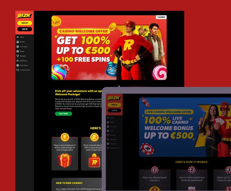
Creating new promotional pages is difficult, often resulting in compromises from all teams. Our Content Team needed a simpler, and more flexible solution to build the promo pages without technical bottlenecks.
Key issues identified:
🚧Difficult Process: Building a different promo page required coding work, slowing down execution;
🔧Limited Flexibility: Teams had to choose between templates and coding, which involved more time to design & develop;
🙈Poor User Engagement: Existing pages weren’t visually engaging, and the main information wasn't easily accessible.


How might we build a different promo page with no coding required?
The people


This project was important for us, so we prioritized it! Together with a Web Designer (Valentino) and a Product Designer (Jessica), we were ready to start our adventure into the unknown territory.
My focus was on:
Aligning with other teams - I helped the team by making sure that all teams were aware of our progress;
Helping with decision-making - Sometimes, great ideas can clash. I tried finding the best out of the 2 worlds and made sure that everyone's opinion was heard;
Support - Support the team as much as I can by testing on different devices or taking small projects so the main focus would be the Promo Pages;
Trusting the crew
The game plan was all about making sure we're all in this together. Our secret weapon was open communication, so feedback was more than welcomed, and everybody had an opportunity to speak freely.


How can we uncover insights? By letting the numbers speak
Competitor Analysis
Hotjar and beyond
Before jumping into solutions, we needed data-driven insights. I led research efforts through:
Identified industry best practices in promo UX.
#1
#2
Voice of Customer
Gathered direct player feedback to understand expectations.
#3
Hotjar Analysis
Heatmaps and session recordings revealed key friction points.
#4
Stakeholder Interviews
Engaged with marketing and content teams to uncover operational inefficiencies.
"
"
Would be easier to see all the promotions we have opted into by having a tab in profile labelled opted in promotions.
Always have timer on promotions. You have been a favourite site since I’ve joined. If I miss out on 5 Super spins by mins because I didn’t know timing it dampers experience.
What our customers say
So what did we learn from this? Like deciphering an ancient scroll, everything started to make sense:
TRANSPARENCY IS KING:


Our players want clear and easy-to-understand information;
VISUALS NEED A POWER-UP
Eye-catching visuals are essential for grabbing attention;
SIMPLIFY TO CONQUER
A user-friendly experience is the ultimate victory. Users were dropping off the page due to unclear information.
Findings
How do you build a project when the roadmap’s a blank page?
Collaboration is key
Technical Limitations
If I could summarize the project in 3 words, I'd go with: "test, tweak, test again."
I provided as much support as possible while staying focused on the research. By that, I was hoping to see ideas, good or bad, and that every iteration had the potential for something bigger.
This iterative process wasn't just about aesthetics, it was about offering easy access to the information.
Forget all the initial plans. This was like building a ship in a bottle! We didn't have any documentation, so we had to find the best solution. The new promo pages tried introducing a more structured modular layout, allowing for scalable promo displays across all brands. Key improvements included:
Stronger CTAs & Readability – Headlines were refined, key information surfaced earlier, and redundant text was removed.
Dynamic Filtering & Categorization – Users could easily find relevant promotions without excessive scrolling.
Improved Mobile Experience – A touch-friendly design made navigation effortless on smaller screens.
THE PROCESS
Is there anything simpler than building a website by just dragging and dropping the elements you need? That's what we were aiming for. Aside from a few ever-green promos, each one is unique. We wanted to make sure our teams had all the tools they needed.
🚧 Problem: A fully drag-and-drop system was difficult to implement within existing infrastructure
✅ Solution: Introduced modular HTML blocks—offering flexibility without full code dependency.
Business Needs & Usability
This straightforward approach allows our experienced Content Team to upload information without having to worry about the visual design. However, we also considered the need for flexibility, allowing for the creation of custom pages for special occasions.
🚧 Problem: Marketing wanted full customization, while dev constraints required standardization.
✅ Solution: Developed dynamic components—structured enough for consistency but flexible enough for special cases.
Multiple Brands
What made it even harder was the need to make it as versatile as possible. We didn't work for one brand, but multiple so each solution had to be tested using different parameters
🚧 Problem: Some brands were sports-focused whereas others were casino oriented.
✅ Solution: Built reusable UI components and a design system for consistency across brands.
LEARNING AND ADAPTING
Speaking of bumpy rides, this was particularly special. The technical approach was changed a couple of times. Have we stopped? No.
For over six months, our world was a testing ground, exploring workarounds after workarounds. It was envisioned as a launchpad for another brand, but business priorities shifted.
Although the project pivoted due to changing priorities, the journey wasn't in vain. The developed code modules serve as a valuable foundation for future endeavors, saving time and resources.

EPILOGUE
While the project may not have followed the initial plan, the journey wasn't in vain. It allowed us to put both our technical and interpersonal skills to the test, setting the stage for the sequel.
From a business perspective, the reusable codebase can serve as a foundation for future projects.
There is no denying that we were hoping for a different outcome. Sure, working in such a regulated industry, such a project can be more challenging, but hey, who doesn't want a challenge from time to time?
The final takeaway is that if change is the only constant, this project could be reborn on any given day.